Experian- Credit Report Consolidation
Experian is a consumer credit reporting company and is one of the "Big Three"
credit-reporting agencies, alongside TransUnion and Equifax.
Experian collects and aggregates information on over one billion people and businesses including 235 million individual US consumers and more than 25 million US businesses.
Its consumer services include online access to credit report and products meant to protect from fraud and identity theft. As part of the company’s goal to empower its users and to be the “consumer agency” they needed to create a new digital experience for its credit report page.
Role: Lead Product Designer
As part of a much larger agile team, my role was to lead the UX from identifying current challenges, restructuring the information architecture, sketching wireframes and designing hi-fi mocks all the way to prototyping and user testing.
As part of leading the UX, I worked closely with PM's, stakeholders, researchers, compliance advisors and fellow designers across the organization to better understand the design considerations, business needs and constraints.
The Problem
-
The current credit report is a cumbersome layout of multi level navigation system, multiple tabs to navigate back and forth from, repetitive information and overall overwhelming and confusing experience.
-
Users seek more credit and financial education than what is currently offered on the site, about what impacts their score and why their scores differ across reports.
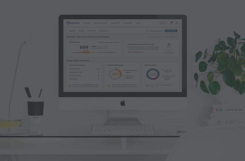
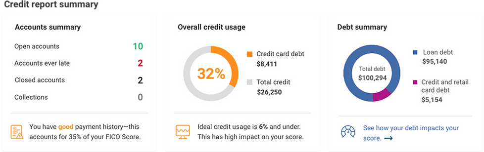
Reports and Scores- Summary page
Reports and Scores-
Credit Reports page, Summary tab


The old experience: multi-layer navigation system, redundant information, ads and upsells.
Reports and Scores-
Credit Reports page, Accounts tab
Project's Goal
-
The main goal was to simplify the experience by consolidating all parts of the report into one scrollable page and eliminating redundant information so all necessary data is available on a high level while still allowing a deep dive.
-
Provide more contextual and embedded links to educate users on how their score is generated, how to improve it and why scores slightly differ across bureaus.

The Process
1. Evaluation
The research process started with an evaluation of the current credit report experience and identifying user pain points through user interviews, feedback and customer panel.
2. Comparative and Competitive Analysis
The next step was a Comparative and Competitive analysis: Credit Karma, TransUnion, Mint and online banking apps. Once the foundation was laid out in terms of navigation and hierarchy it was time to start sketching different layouts.
3. Information Architecture
After looking at our competitors and gathering insight from existing user feedback, we dove into whiteboarding the current navigation system to restructure the information architecture.
By creating an "inventory list" of all the pages and components the report is encompassing, we determined main categories and eliminated others.


Success Parameters
-
Easy to read / understand / navigate
-
Ability to find information – Sections organized / prioritized intuitively
-
Intuitive placement of promo features
-
Integrated tips / insights
-
Provides a clear next step
-
Informs of their current credit standing
-
Unintrusive integration of upsells
User Testing
For the in-person usability testing we recruited 10 interviewees of mixed age and gender and tested both desktop layouts as well as responsive mobile design.
Version A, with the credit report summary areas at the top and version B with a two columns layout and credit report summary not grouped together.
Version A.

Version B.

LAYOUT
Users appreciate seeing their score in the upper left and gravitate to the credit summary information, on both Desktop and Mobile. Layout A, with the credit summary areas at the top, takes the lead in terms of overall preference and ease of navigation.
DATA COMPREHENSION:
Most indicate the report provides a more detailed view of their credit status than other services and are compelled to improve. The amount of detail provided per account is comprehensive and compels users to think about their financial management needs to help improve their credit.
Accounts- new

Accounts- old

On the left: the new accounts section layout is separated by account type (credit card, auto loans, real estate loans, student loant etc.), and each type has it's own sub section of open and closed accounts.
Above, in the old report there is no separation between account type and they're all piled together under "open" and "closed.
Account details- new

Account details- old

On the left: expanded view of account details: chunked into easy to read and understand sections. we added a graph to show credit usage and a prominent Dispute button, as well as highlighted the most important data point of Late Payments and integrated empowering messaging and tips.
This work required a close collaboration with our compliance division as we tried to simplify the terminology used and eliminate confusing attributes.
PROMO PLACEMENT:
Unprompted, majority notice and explored the promo features including Score Boost, Credit Lock, Dispute Center and Compare All (3 bureaus). These CTA’s effectively raise awareness of new product offerings, which are seen as differentiators, and many indicate they would explore further as a next step.

Score Boost
The location of the “Boost” promo on Design A is prominent and clicked. However, “free” is often overlooked. Most would consider exploring to learn more.

CreditLock
CreditLock is a differentiator for Experian. We integrated it into the inquiries section to highlight it's value and show the connection between inquiries the user initiated and unauthorized ones.

Compare All
The ability to compare all three credit bureau reports is highly valued and the depth of information is seen as a differentiator.
Although many still seek to understand why there are differences across all three bureaus.

Dispute Center
Access to the Dispute Center is prominent throughout the Credit Report and users indicate the process to dispute seems very easy.
It is intuitive to file a dispute for a credit or loan discrepancy
Final Design
After testing both versions, Version A took the lead in terms of overall preference and ease of navigation.


How might we improve?
Overall, users are pleased with the new Credit Report experience; The new design and layout is easy, useful, and engaging. Many also liked the colors used, notably the orange, green and red highlights, and often try to click on the red to review and/or take action.
However, there is more opportunity to improve and make the experience better. After wrapping up the usability testing we continued to iterate upon the following:
-
Provide more contextual and embedded links near the report score page to educate users on how their score is generated and why scores slightly differ across bureaus.
-
Consider allowing users to click the highlighted red / green content and hyperlink to the relevant area; Or offer an overlay that explains where to find this data.
-
Enhance Promo Landing Pages:include more examples and benefits (e.g., immediate boost, free trial, etc.) on the promo landing pages to help differentiate and drive action.
-
Integrate more tips and simulation tools to help improve / manage credit in the summary areas and possibly the account detail section.
-
Help educate users on credit terms and labeling (e.g., Inquiries) by enlarging the “Info” icons and providing more intuitive definitions.